How to use Schedule insights
Key word | Key word
In this article we will cover how to use the Schedule Insights feature in Seer. This powerful tool helps you to see how your scheduling looks within your center. It will alert you to any areas in your schedule where you may have gaps in coverage in your teacher to student ratios. It will also show you areas where you will have too many teachers scheduled in your classes based on your ratios of scheduled children. With this tool you can easily see and schedule any of these gaps and know where to scale back on coverage saving you on your labor expenses. Using this tool can be one of the greatest ways Seer can help you operate your center more efficiently and help you save money.
To access your schedule insights, go to Schedule Insights tab on your Dashboard. Inside you will see all educational classes displayed here. On this page you can change the time breakdown of the chart as well as choose if you want to view it by the day or the week. You can easily pick dates with the date picker as well. You can change the time breakdown of your chart as well.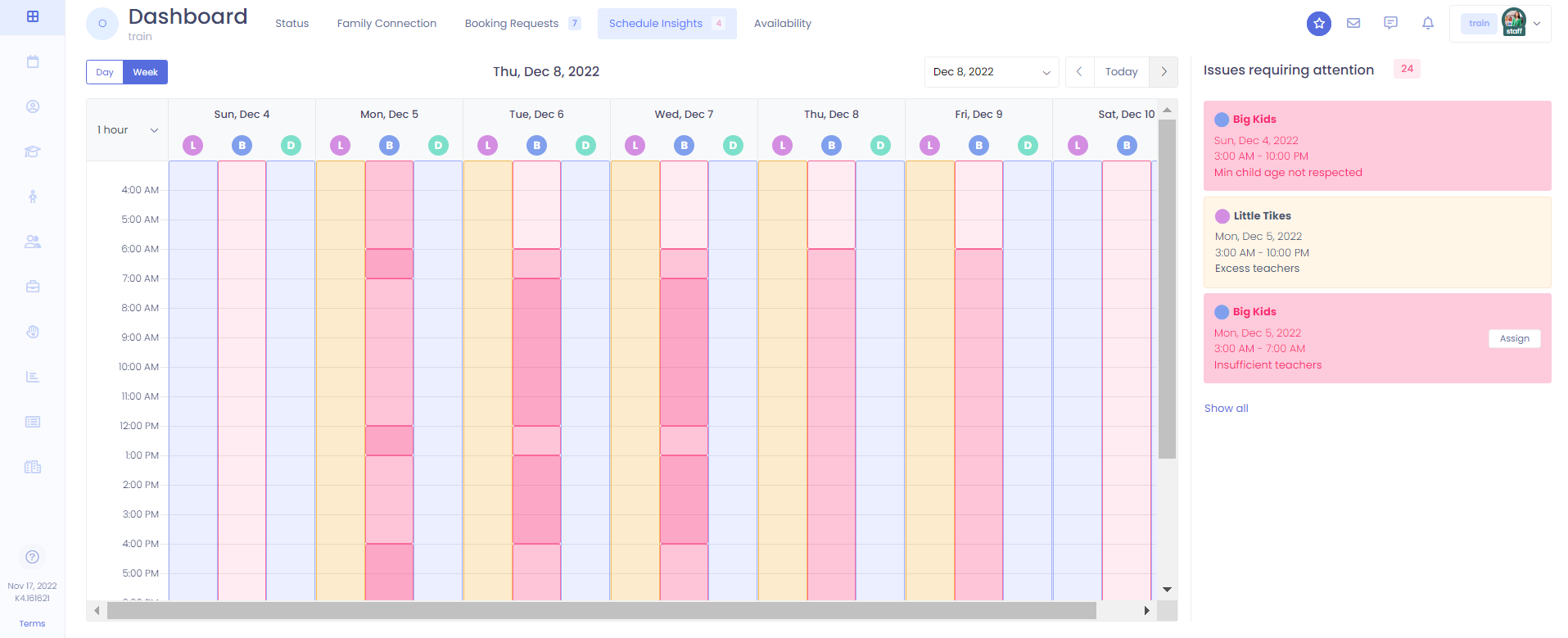
1. Any issues that are present will be shown in a breakdown on the right side of the screen. In the case of needing more teachers scheduled for ratio reasons it will show an assign button and bring up a window where you can assign staff for that specific time period.
2. There are also counters letting you know which how many issues you have inside schedule insights. The number that is displayed on the right-hand side where the issues are broken down shows you how many issues you have total for either that day or the remainder of the week depending on your view. The counter on the tab at the top shows you your pink critical issues for the week.
3. With use of this tool you will always be able to see any scheduling issues within your center and be able to take action before you have the issue arise.
Please Note: The chart will display in several colors based on what is happening during different time periods so you can see things at a glance. All colors are based off your scheduled teacher to child ratios for the class. Blue signifies that you have a good teacher to child ratio within that class. Orange shows that you have excess teachers in your class and could pull back scheduling during those times. Pink shows where you have a gap in coverage and have insufficient teachers or children who should not be scheduled in that class due to age restrictions.
You can also find your exact ratios for different times on this chart. Any time your scheduled ratio will change in the class you will see fraction displayed at that time. This is always represented by the number of teachers on the top and the number of children on the bottom.


